
INTERACTIVE MEDIA
Interactive Media Graphics
Navigation Bars
This the part of the website which allows you to access and navigate around the whole of the website. For a portfolio website, this might include sections like an about page, a showreel section and a shop. The sections use hyperlinks to move to different parts of the website (more on this later). These are all conveniently placed at the top of the page, or the side for this website, for most websites so users know how to get to where they want.

Premier League navigation bar
Rollover Buttons
Rollover buttons are sections in a website like in the navigation bar where if you move your mouse cursor over them they will change. This could be that they change colour, size, orientation or what it is completely. These are used to give the user some satisfaction and helps to indicate that something has happened. An example of this is when shopping there may be a rollover button which changes from "add to basket" to "added to basket" and changes colour.
Animated Graphics
Animated graphics are simply moving animations incorporated into websites. These are very eyecatching and make the website more interactive as it makes it feel like something is happening. Some websites like Apple use animations to move text and images onto the screen as you scroll down. Another use of animations is on the Club Penguin website. On the homepage, there was an animation of the island with a jetski zooming past, penguins interacting in the background and the blue penguin would talk to you and show a video. This made the homepage very welcoming and friendly the children from the late 2000s and early 2010s, like me.

Club Penguin homepage
Drop Down Menu
These are a part of the the navigation menu where if you roll over or click on a section, a menu drops down with more sections to go to. These are used to make the website more aesthetic pleasing by grouping lots of sections into one larger one. They are also good because it means the user can go to a more precise section with only two clicks rather than going hunting to find it.

Liverpool FC shop player drop-down menu
Hyperlinks
Hyperlinks, also known as links for short, is a link which builds a bridge from one section of data to another. By clicking or tapping the link it takes you to a different document or section within the original website. One way they can be used is that they can be used in websites to take you to different sections of it. At the top of your page, there is a hyperlink which is specific to this page. This link can be shared and will always take you to this part of the website.
Graphic Design Techniques
Colour Theory
Colour theory is the idea that certain colours work better together than others. This uses the colour wheel which uses the primary colours, secondary colours and tertiary colours. There are different combinations that work well together:
- Monochromatic is the use of one colour and the variation of the saturation and value. This is good as they are always going to match.
- Analogous is when two colours that are next to each other are used for example red and orange or blue and green
- Complementary colours are two colours that are opposite each other on the wheel like red and green or orange and blue.
- Split Complementary colours is the use of three colours in a triangle like red blue and green. I like this as it gives more colours to use with the same amount of contrast and potentially more unique results.
- The triadic formula is using three colours, again, but they are all evenly spaced apart, for example, orange, green and purple. However, these combinations can be very bold and don't always give the same results as the others do.
- Tetradic colours uses two complementary colour pairs together like blue, yellow, orange and purple. This group works best if there is the main colour and the other three are used as accent colours.
These are just supposed to be starting points and not strict rules to follow. And most colour pallets work well together if you use the best hues and values to give a contrast.
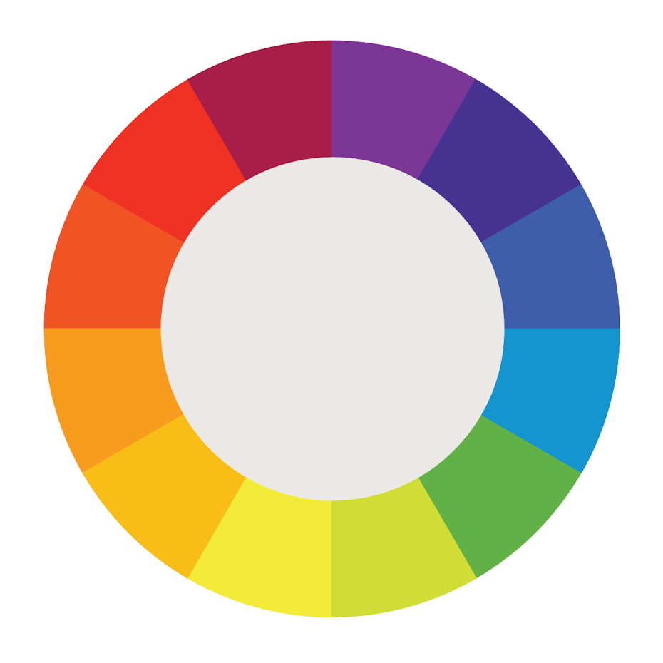
Colour Wheel
Visual Communication
Companies use logos for their brand as it helps them to be recognisable, like football teams. It is normally the first thing the viewer sees when entering a website and you can get judged there and then. This is why it is important to have a good logo as it can help bring in customers if it is recognisable and interesting. Some logos have easter eggs in them to help promote their business. For example, the Beats logo is a red circle with a "b" but it also can be a simplified person wearing headphones. Another is the Toblerone logo, the company originates from Bern, which is known as the city of bears, with a bear hidden in the mountain.

Hidden messages in Toblerone
Layout & composition
Presentation is key when designing a website. The layout needs to be simple and look well made as it is likely to be the first impression for the viewer. One key layout feature should be a prominent logo. This is normally positioned in the top right corner as people read from left to right like a book. Another thing, the information should always be positioned in the middle of them website and there should be lots of space so it doesn't get cramped. I think that websites should use multiple colours so that it isn't boring and there is lots of different things to take your interest.
Typography
Some companies create their own fonts so that they can be recognisable with the font alone. Companies normally use the same font, or combinations of fonts, in all media including trailers, posters and social media posts. Some fonts made and used by big companies include Super Mario using the Super Mario font, Rovio Entertainment uses ABFlockText Font for the hit mobile game Angry Birds and Marvel uses Avengeance for the Avengers Film franchise. There are 3 main types of fonts:
- Serif which is when the font has extra tangents, or serifs, and conveys that the brand is upper class and fancy. Some examples of brands that use this type of font are Giorgio Armani, Rolex and Hugo Boss.
- San Serif which basically means no serifs. These logos are generally more modern and clean. Some examples of brands that use this type of font are Microsoft, Adidas and Facebook.
- Script is a font which is like calligraphy. It uses a lot curls and can be linked to femininity and elegance. Some examples of brands that use this type of font is Coca-Cola, Kellogg's and Disney.
Aesthetic Appeal
Graphics for logos and other projects don't normally look their best on your first attempt. You normally need hours of blood, sweat and headaches before you reach your final design. You should attempt different styles, colour combinations and effects. I think it is a good idea to go to a group of people, whether if it is your friends, family or random people. This is because other people may like a different design to what you like and I think it is a good idea to try and incorporate a bit of both in the final design. Sometimes the logo may change to keep up with the changing times, for example a 2000s logo may need some revamping for the 2020s. I still think the logos should stick to some sort of the original theme whether thats the colour combination or a section of a design. One example of this is the Liverpool FC changing as they have been around since 1892.
